CANADIAN WOLF BIRD
Est. 2025 · No. 02
Brand & Beverage Packaging

Canadian
Wolf BirdGinger Ale

A vintage-inspired packaging system for a fictional Canadian craft ginger ale — concept, illustration, can, carrier, and mockups.
Role
Brand · Illustration · Packaging
Deliverables
12 oz can · 4-pack · 3 mockups
Year
Spring 2026
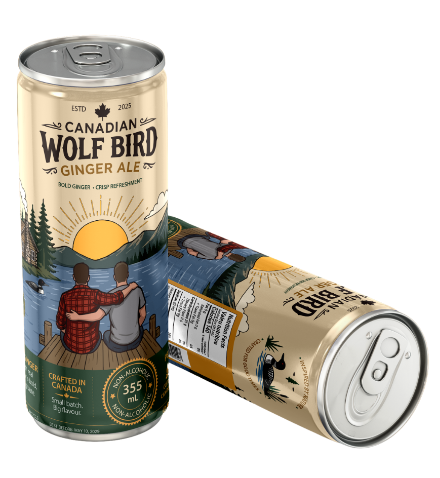
Two Canadian Wolf Bird ginger ale cans, front and back
Scroll
01The Project

Build a beverage worth putting on a shelf.

The goal: an original packaging system for a craft beverage in a 12 oz slim can, with a matching four-pack carrier and mockups that show it in context.

I chose a non-alcoholic craft ginger ale and built an entire fictional brand around it — Canadian Wolf Bird — rooted in the imagery of the Canadian backcountry: lakeside cottages, pine forest, still water at first light, and the call of the loon.

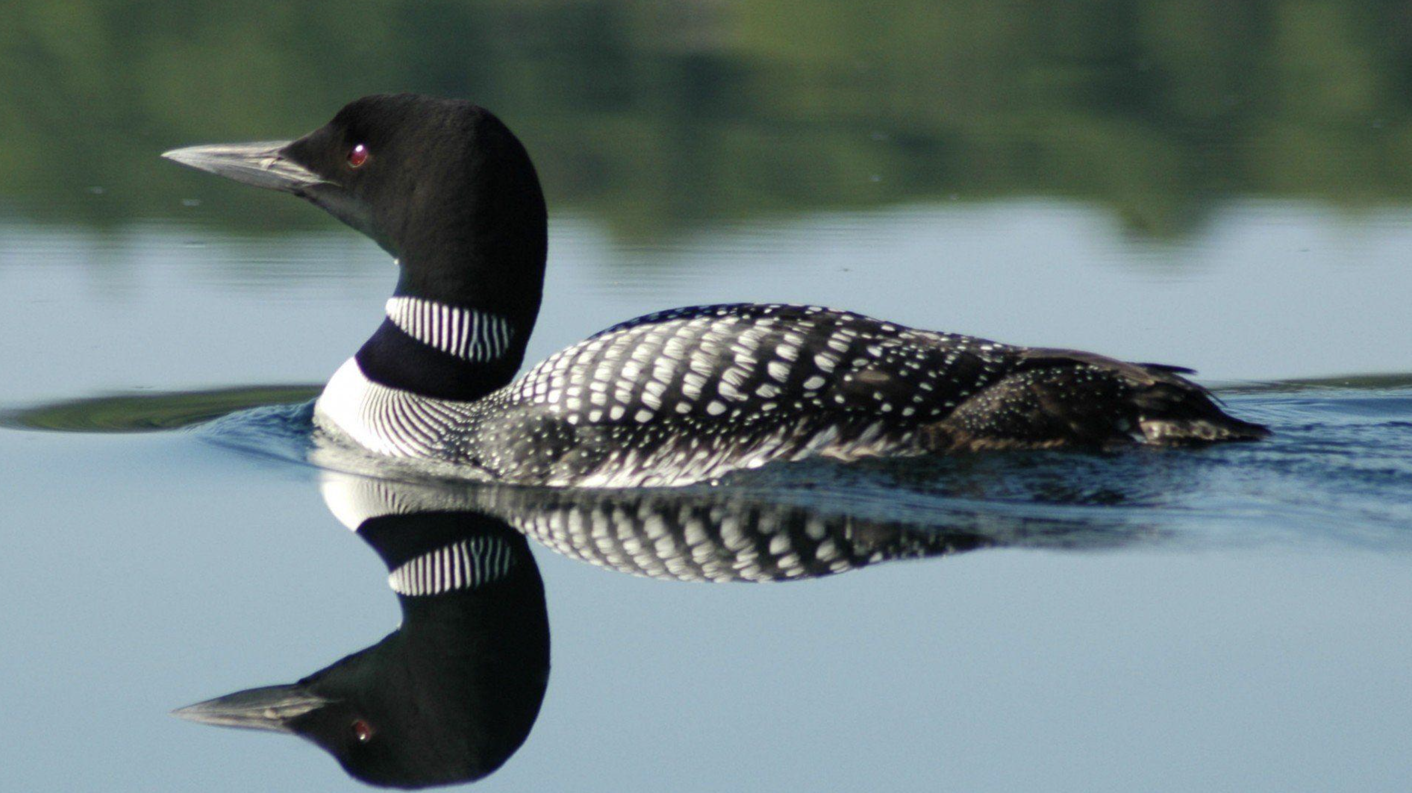
The nickname does the heavy lifting. In Northern folklore the loon is called the "wolf bird," so the name carries the wilderness, the wildlife, and a little mystery in three words.

Rather than a flat front and back, the label reads as one continuous scene — a dock on a quiet lake at sunrise — that you discover as the can turns in your hand.

02Inspiration

Built from a Canadian summer.

The world came first. I pulled from the quiet of the Canadian backcountry — still water at dawn, a cabin with smoke in the pines, the lonely call of a loon across the lake.

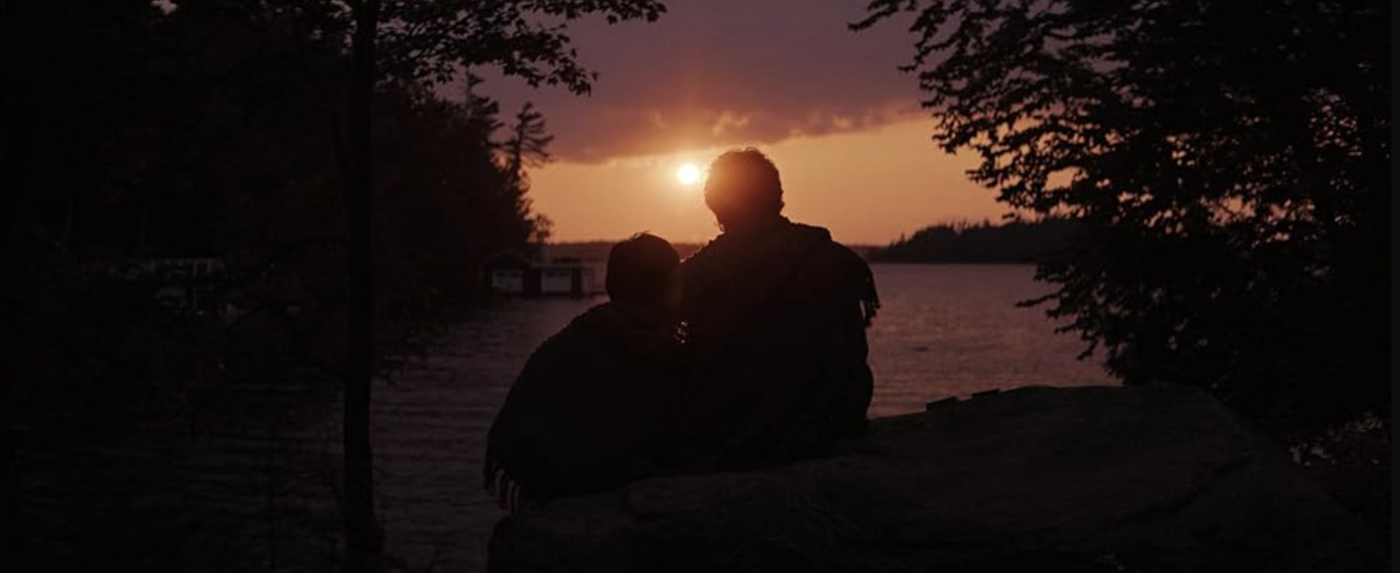
Vintage craft-beverage labels and weathered lodge signage shaped the lettering and ornament. The brand's emotional center came from Rachel Reid's novel Heated Rivalry — the source of the dock, the closeness in the illustration, and the name on the can.

  • 01
    The backcountryCottages, pines, loons, and still lakes at first light.
  • 02
    Vintage craft labelsHand-tuned serifs, flourishes, and a muted heritage palette.
  • 03
    Heated RivalryRachel Reid's novel — the warmth that frames the scene.
Heated Rivalry inspiration
03Concept & Sketches

Three directions, one world.

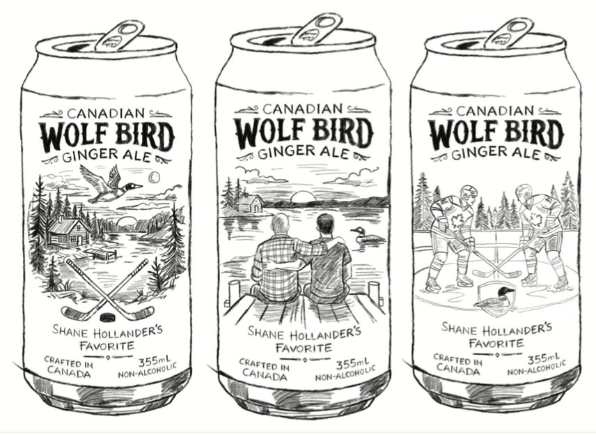
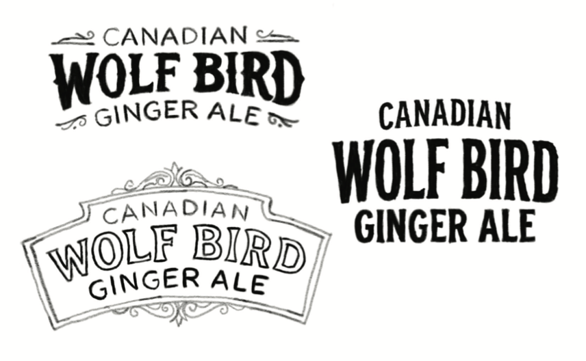
Before committing, I explored three illustration routes and tested the wordmark until the lettering felt crafted instead of corporate.

Three can concept sketches in pencil
Can concepts — pencil studies
Wolf Bird wordmark lettering studies
Wordmark lettering studies
  • The lakeside cottageA cabin and pines framed by crossed hockey sticks — heritage and sport in one mark.
  • The dock at sunriseTwo figures looking out over the water. Warm, human, and unmistakably "lake season." This one won.
  • The face-offTwo players nose to nose with the loon set between them like a crest.
  • Lettering studiesVintage, rustic, and modern-condensed wordmarks — landing on a hand-built vintage serif.
04The Can

A label that does two jobs at once.

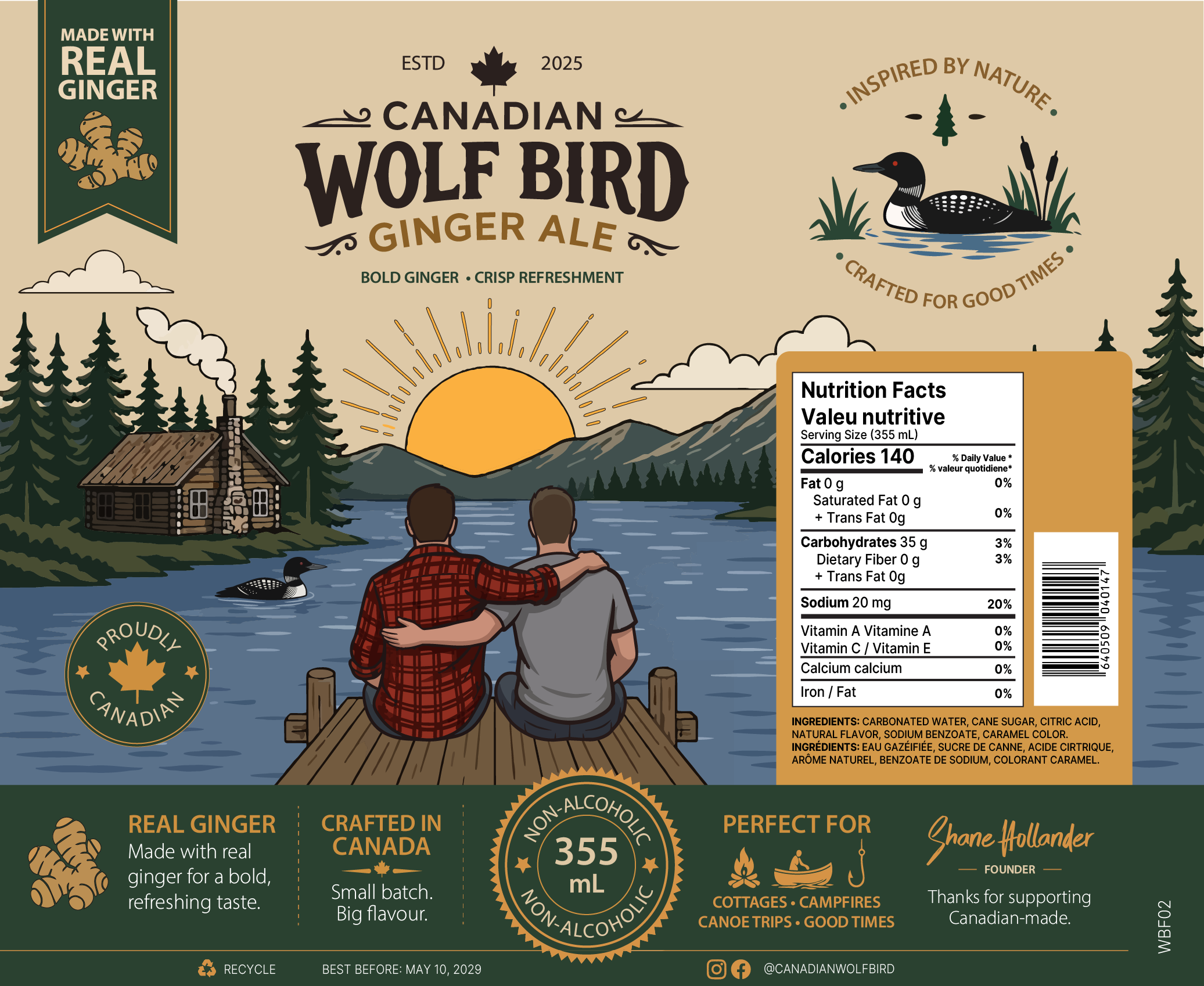
A full wraparound illustration on one side; a working information panel on the other — designed to meet real beverage conventions.

Flattened Canadian Wolf Bird can label artwork
  • Continuous sceneThe sunrise, lake, and cabin wrap unbroken around the can.
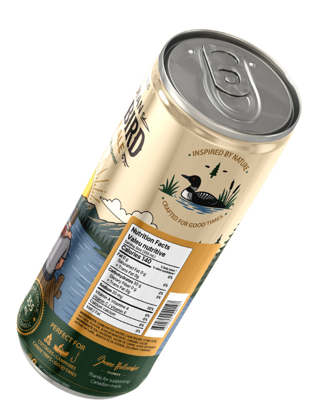
  • Bilingual panelEnglish / French nutrition facts, ingredients, and barcode.
  • The loon markA "crafted by nature" badge anchors the brand identity.
  • Founder's signatureA signed endorsement and "Proudly Canadian" seal sell the craft story.
05The Carrier

One landscape, four cans.

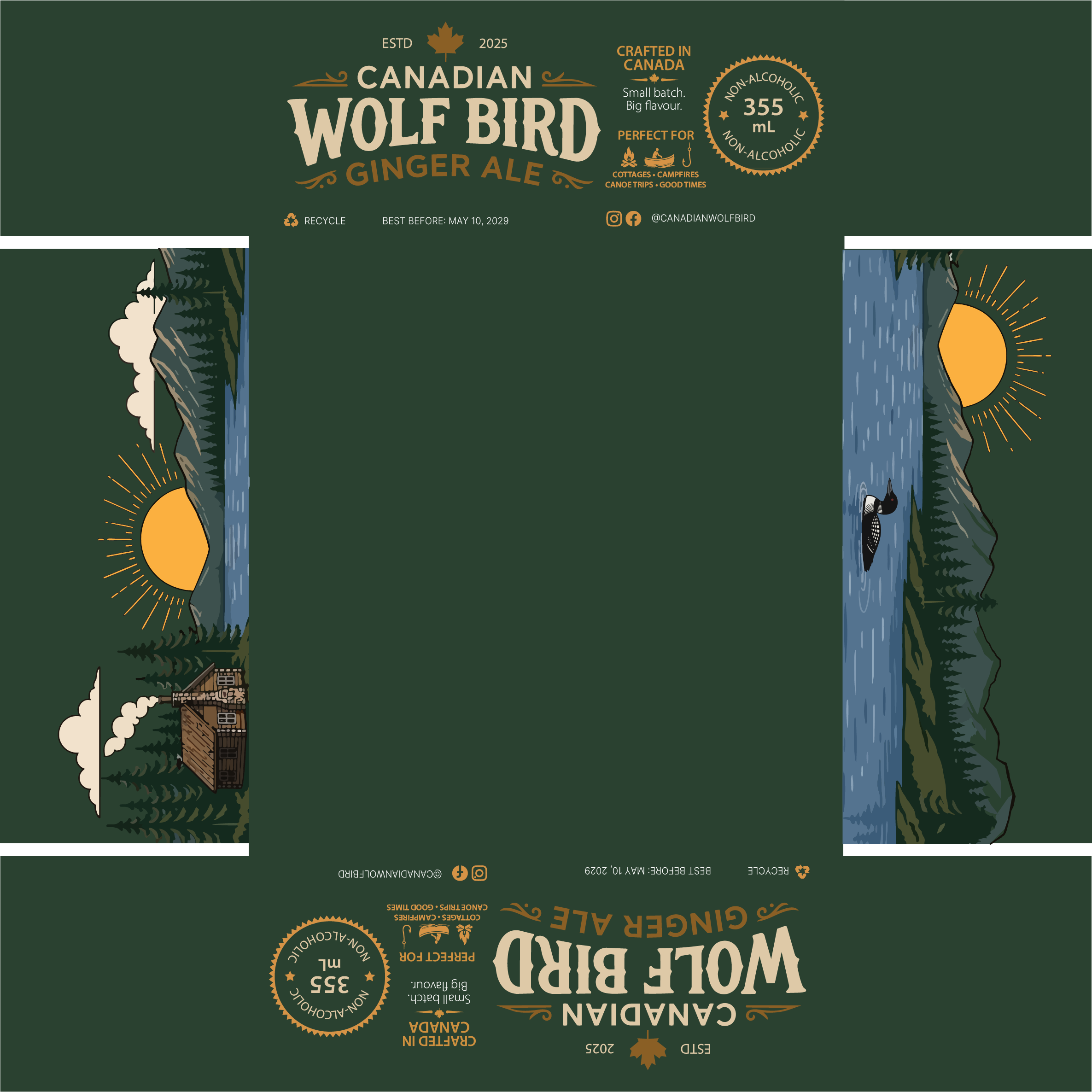
The four-pack carrier extends the same scene across its panels, so the artwork continues unbroken when the cans sit inside.

The top flap repeats the wordmark, volume, and key details for shelf visibility — the part a shopper sees first looking down into a cooler.

Canadian Wolf Bird four-pack carrier dieline
06In Context

Tested in three dimensions.

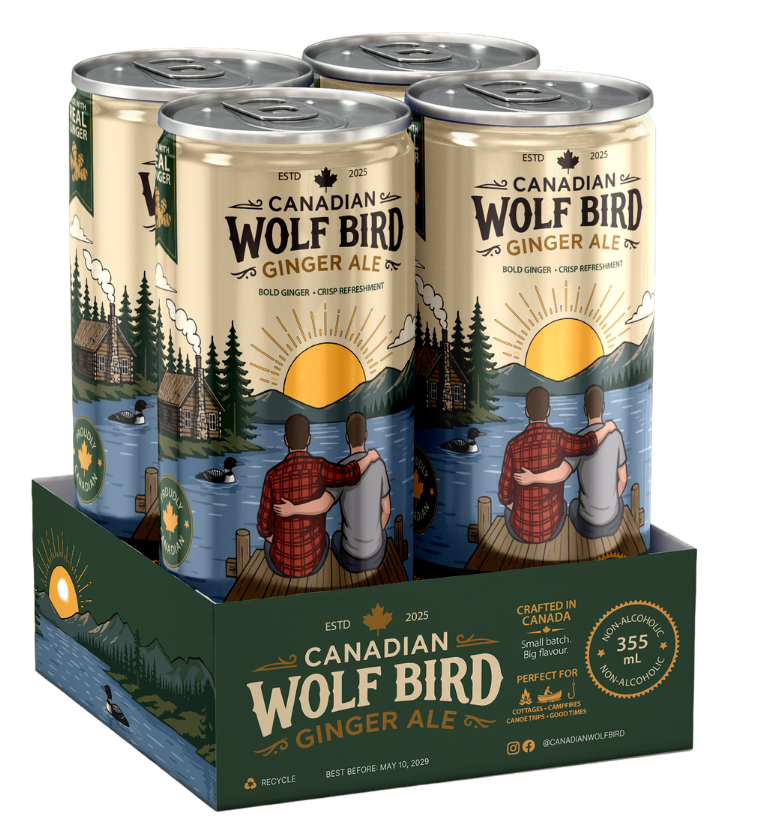
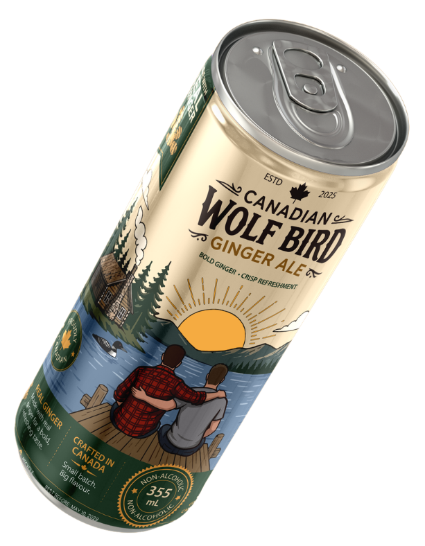
Rendered in Photoshop to check how the scene wraps, how the panel sits, and how the four-pack reads on a shelf.

Four-pack carrier with cans
Single can, illustration side
Single can, nutrition panel side
07Design System

The kit behind the brand.

Palette
Forest green for depth, parchment for warmth, gold for the ginger and the morning sun, rust pulled straight from the flannel on the dock.
Pine Green #2A4130
Parchment #ECE2CC
Sunrise Gold #F8A52D
Bronze #8A5F25
Flannel Rust #9E3B2E
Wordmark
Wolf Bird
A vintage, hand-tuned serif with ornamental flourishes — the voice of an old lodge sign.
Supporting
Bold Ginger · Crisp Refreshment
Condensed uppercase for callouts and labels keeps the panel tight and legible at can scale.